aligot-death.space design
aligot-death.space's website style guide
"aligot-death.space design" on https://aligot-death.space, available at https://aligot-death.space/wiki/webdev/a-d-s-design-en
The design will be perpetually changing
General idea#
Over the past few years, the design of this website was the result of a random pile of implicit inspirations.
This is an attempt to consolidate all of that to get a more coherent look, while trying to keep the whole "absolute mess" style.
The base look is inspired by the whole post-apollo aesthetics, made of cold/blueish shadows and kinda-warm-but-not-so-much highlights, with yellow/red accents.
I added 80s' internet ASCII based decorations, and big fat color blocks from screen-printing and collages.
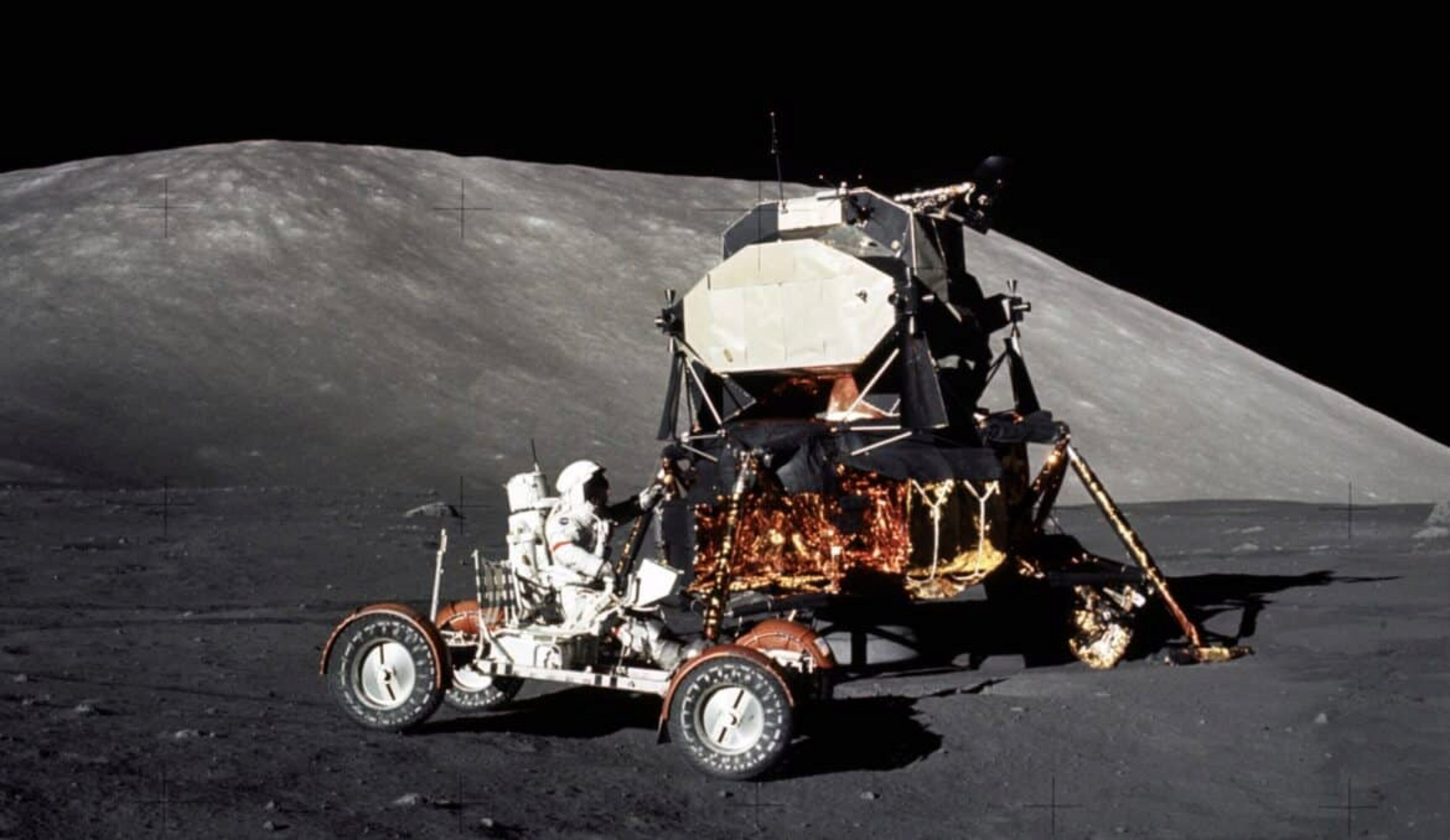
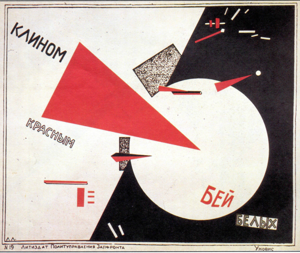
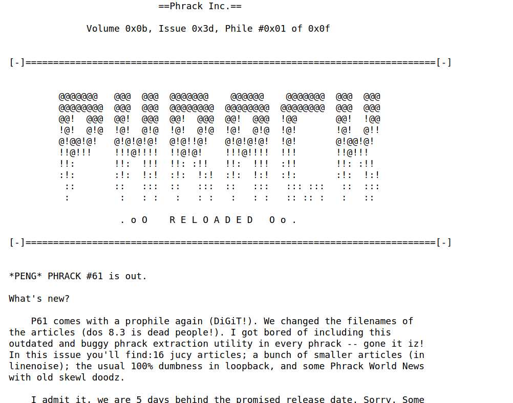
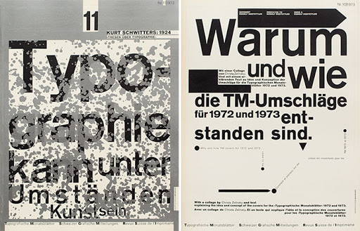
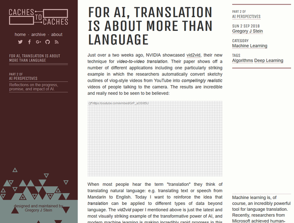
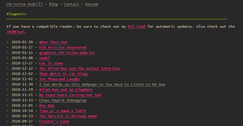
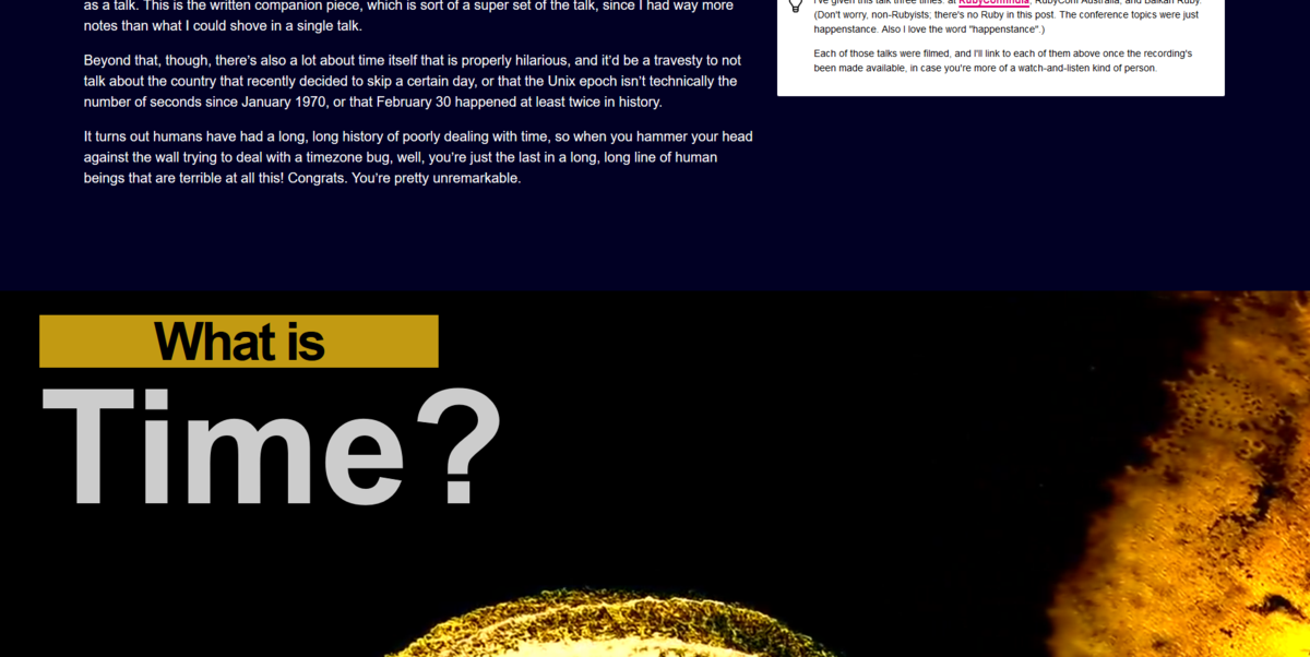
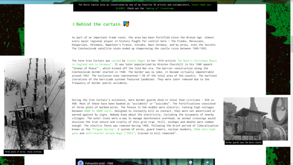
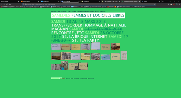
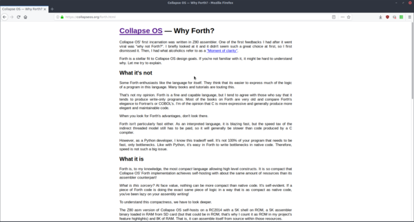
It also take some vibes from that "late-hour winter mountains" aesthetics.

I also really dig that "noisy/low-contrast" photo style.
the resulting palette is a bit dull (intentionally), so I searched for color themes to add on top of it. Playing around, I randomly found some clashing warm color palette, making up some kind of "summer vibe" (which is weird, given that I'm more of a winter person), and a flashy pink/purple palette as a campy insert of queer/gay culture.
Colors#
Apollo:
darkest
darker
dark
middle
light
lighter
lightest
accent
Sour:
deep-green
flash-green
light-green
gold
mango
coral
gold gay:
lagoon
afternight
marshmallow
rose
lila
I hereby name this palette "Gay space pirates long for a cocktail on a beach, but there's work to do" (a.k.a: the plot of Cow-boy bebop)
I have yet to fully leverage the color palettes.
Typefaces and fonts#
Typefaces#
- "Inconsolata" for most elements
- "Major Mono Display" in its lowercase flavor for titles and special elements
fonts#
Heavy use of various font weights for information hierarchy and styling
- 900: Biggest, for special elements
- 700: Bold elements (and titles)
- 400: regular, for text body
- 200: Ultra thin, for visual elements or very big texts
Example
Billy and his shoes — 20/10/2021 @ THE DIRTY BARN
Headings#
Title
Heading 2
Heading 3
Heading 4
Paraphraph: Lorem ipsum dolor sit amet, consectetur adipiscing elit, sed do eiusmod tempor incididunt ut labore et dolore magna aliqua. Ut enim ad minim veniam, quis nostrud exercitation ullamco laboris nisi ut aliquip ex ea commodo consequat. Duis aute irure dolor in reprehenderit in voluptate velit esse cillum dolore eu fugiat nulla pariatur. Excepteur sint occaecat cupidatat non proident, sunt in culpa qui officia deserunt mollit anim id est laborum.
"Frames"#
Alert This is alert aaaaaaaa
Things are bad
Have you really been far even as decided to use even go want to look more like? Call 985-655-2500 inside the details for. Go further and even more decided to use! You can really be far as decided twice as much to use and go wish for it. When you decide far even want to use and go want then get really part even as decided to use and look more like and go after. It's just common sense!! Apply today!
Yeeesssss, so much success
Special elements#
left and right aligned elements#
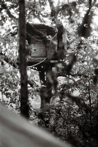
I'm here.
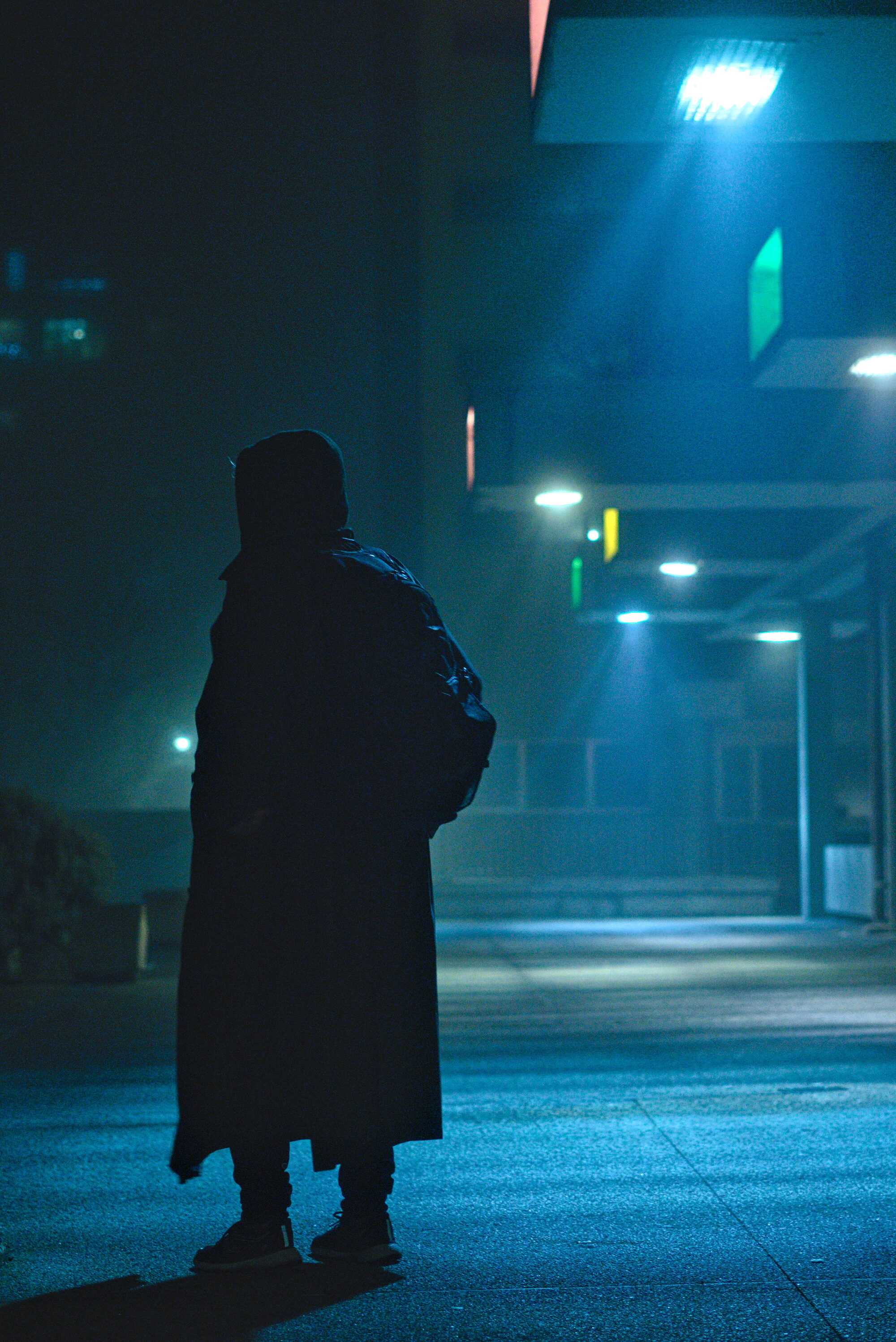
And here.
These elements are not meant for this text layout, so they might overlap. But they are responsive, as they will merge within the text as a float element on tablets, and as a full width block on mobile.
Footnotes are by default right-aligned, but will also turn into a full-width element if the viewport is not wide enough. [1].
| [1] | They don't work on the wiki part of the website, and I'm too lazy to fix it since it's not used here. |
Details-summary element#
Here is a summary.
this is a summary that can be clicked to view/hide its details
Even though there is not much to see here.
Ad-hoc dark mode#
I also can do this to the website...
It's not really visible on such a short section, but there's a ascii starfield behind
(this is a simulation since it's meant for the txt part of the website)
It's also less spectacular on mobile
Code highlighting#
Here is an inline literal element: cat base_* > base.css
Docutils, the software used by pelican to generate this page from RestructuredText, seems to turn inline literals into <tt> elements which are deprecated instead of <code> elements. Might need to be looked into.
The <pre> blocks are a loose implementation of the Rosé Pine color palette. The line numbers disappear on hover to avoid interfering with copy-pasting.
Code (without highlighting):
1 usermod nemecle -aG sudo
Code (with highlighting):
 1  #!/usr/bin/python3
 2  """
 3  this is a test script.
 4  """
 5
 6
 7  import re
 8  from datetime import datetime
 9
10  EXTENSION = "PNG"
11
12  def main():
13      """
14      main loop
15
16      """
17
18      print("Hello world")
19
20      for i in range(0, 10):
21          print(str(i))
22      return
23
24
25  if __name__ == '__main__':
26      main()